Introduction to R: Visualizations with ggplot2
Malte Bonart
Initialize the plot
any variables that are part of the source dataframe have to be provided inside the aes() function
library(ggplot2)
ggplot(faithful, aes(x = waiting, y = eruptions))

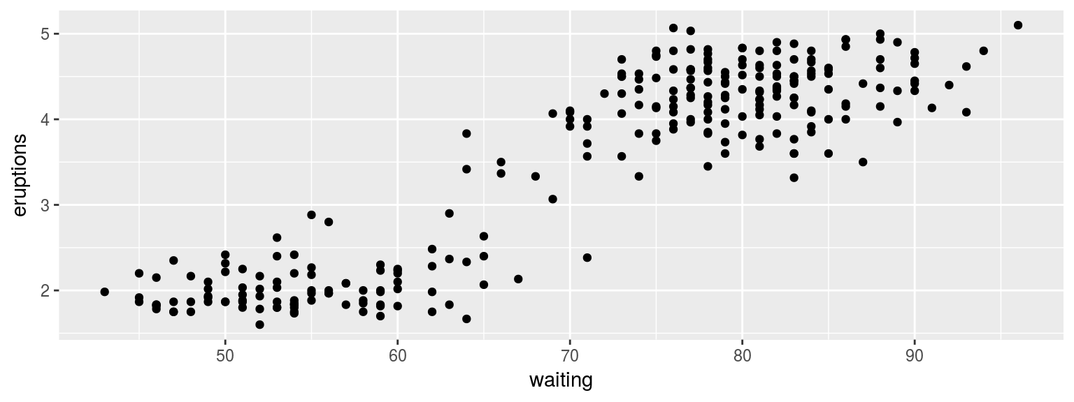
Add some points
additional layers have to be “added” with the + operator
ggplot(faithful, aes(x = waiting, y = eruptions)) +
  geom_point()
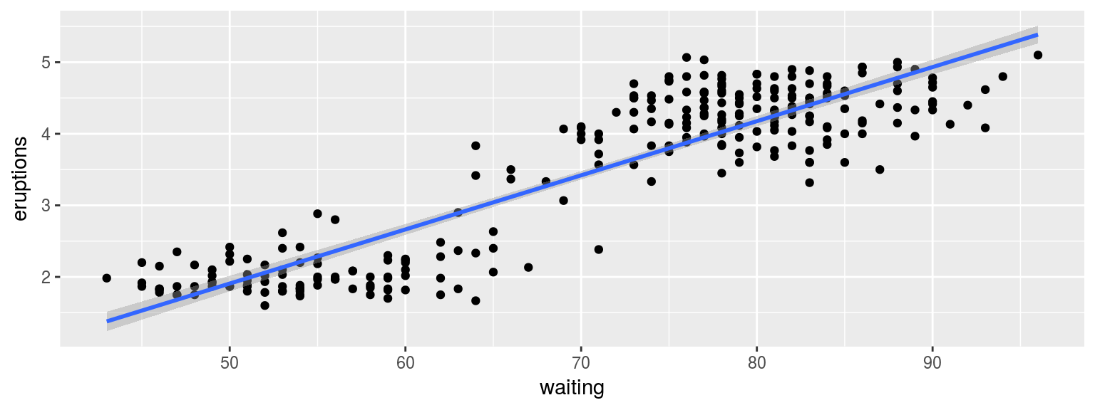
Add a linear trend line
ggplot(faithful, aes(x = waiting, y = eruptions)) +
  geom_point() +
  geom_smooth(method='lm')
Change the color and size
ggplot(faithful, aes(x = waiting, y = eruptions)) +
  geom_point(col ="steelblue", size = 0.9) +
  geom_smooth(method = 'lm', color = "black")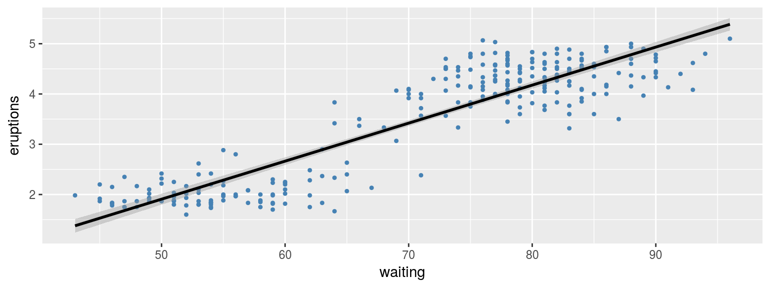

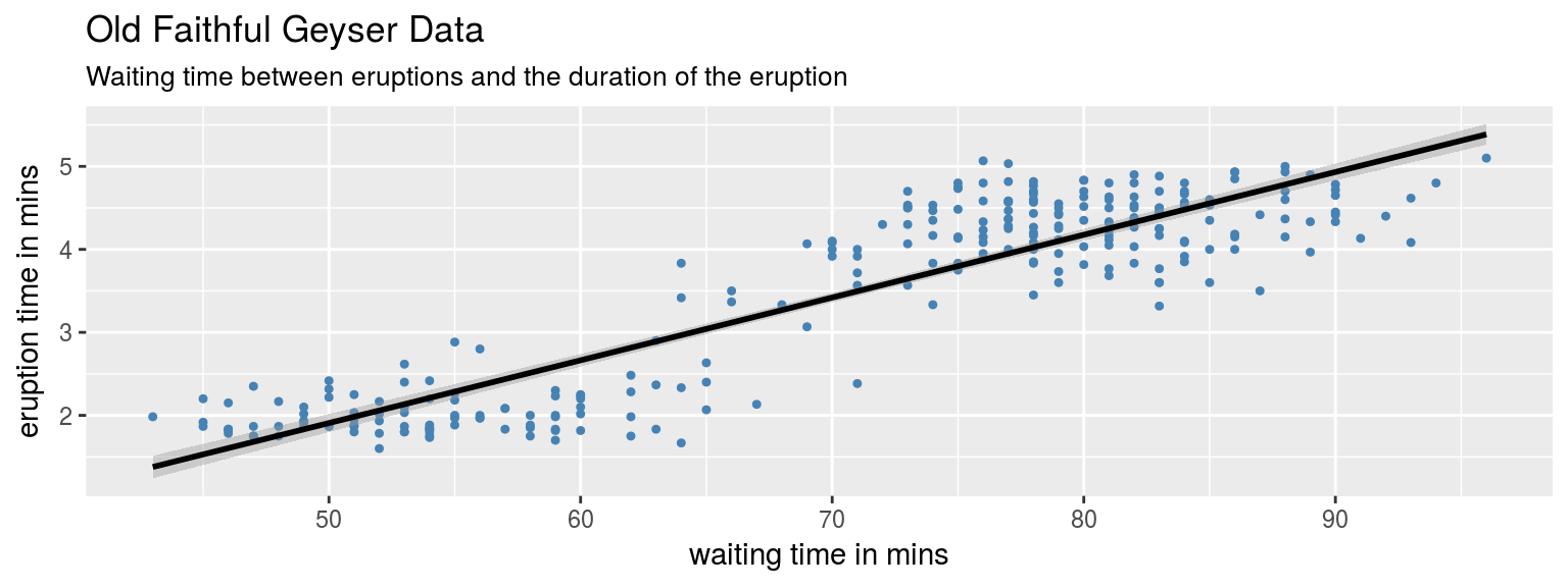
Add some labels
ggplot(faithful, aes(x = waiting, y = eruptions)) +
 geom_point(col ="steelblue", size = 0.9) +
  geom_smooth(method = 'lm', color = "black") +
  labs(title = "Old Faithful Geyser Data",
       subtitle = "Waiting time between eruptions and the duration of the eruption",
       x = "waiting time in mins", y = "eruption time in mins"
       )

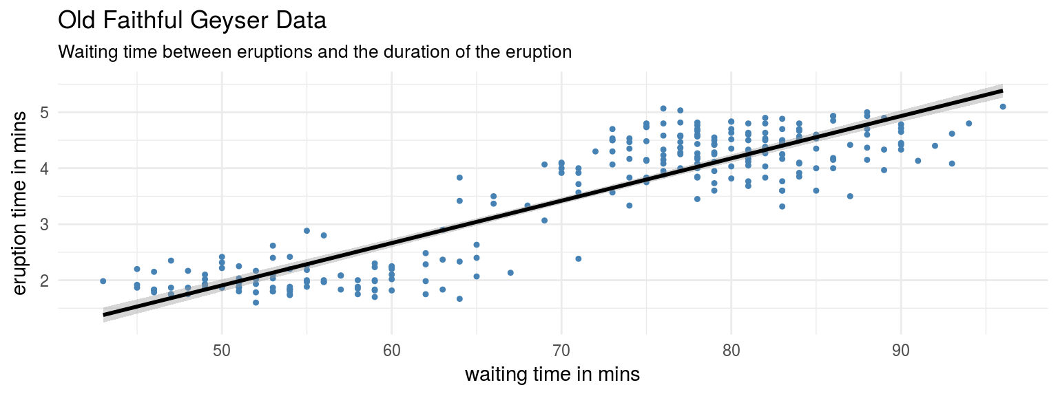
Change the theme
ggplot(faithful, aes(x = waiting, y = eruptions)) +
 geom_point(col ="steelblue", size = 0.9) +
  geom_smooth(method = 'lm', color = "black") +
  labs(title = "Old Faithful Geyser Data",
       subtitle = "Waiting time between eruptions and the duration of the eruption",
       x = "waiting time in mins", y = "eruption time in mins"
       ) +
  theme_minimal()
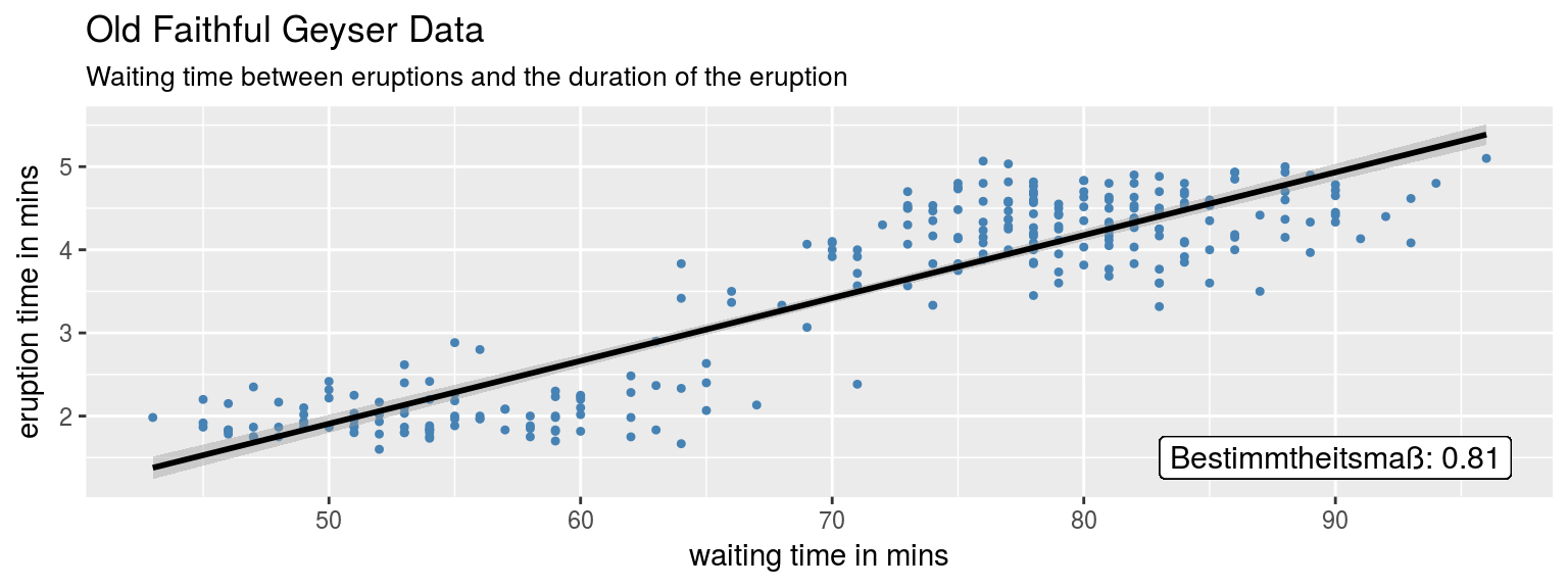
Add R^2 to the plot
ggplot(faithful, aes(x = waiting, y = eruptions)) +
 geom_point(col ="steelblue", size = 0.9) +
  geom_smooth(method = 'lm', color = "black") +
  labs(title = "Old Faithful Geyser Data",
       subtitle = "Waiting time between eruptions and the duration of the eruption",
       x = "waiting time in mins", y = "eruption time in mins"
       ) +
 geom_label(x = 90, y = 1.5, size = 4,
            label = paste("Bestimmtheitsmaß:", rSquared))
Histogram with subplots
ggplot(titanic, aes(x = age)) +
  geom_histogram(binwidth = 5, na.rm = TRUE) +
  facet_grid(~ sex)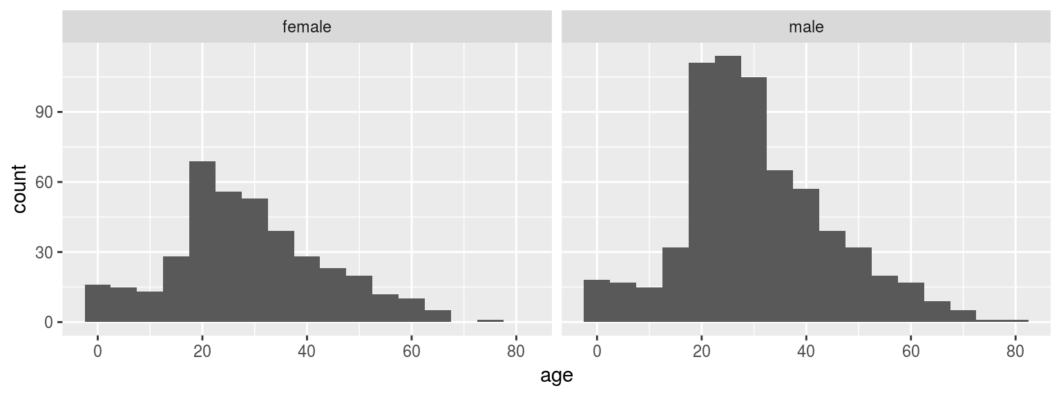
Bar chart by groups
ggplot(titanic, aes(x = pclass, y = age, fill = sex)) +
  geom_bar(stat = "summary", fun.y = "mean", position = "dodge")
Warning: Removed 263 rows containing non-finite values (stat_summary).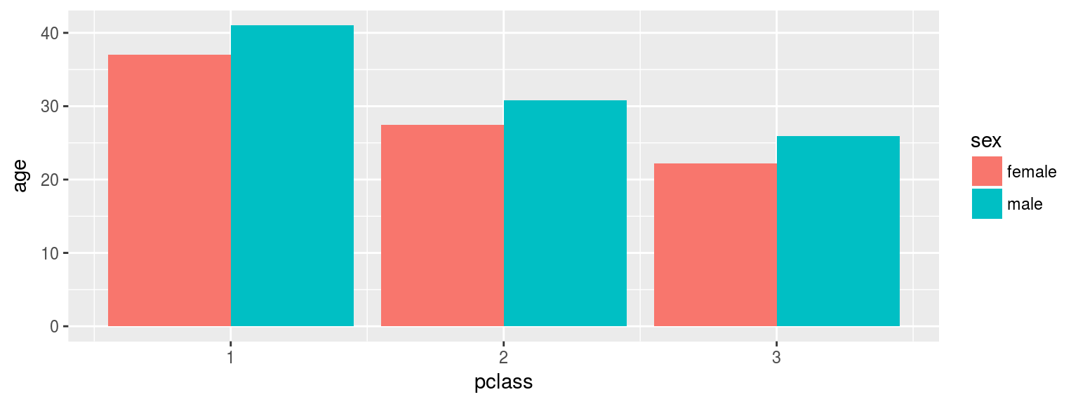
Boxplot by groups
titanic$pclass <- as.character(titanic$pclass)
ggplot(titanic, aes(y = age, x = pclass)) +
  geom_boxplot()
Warning: Removed 263 rows containing non-finite values (stat_boxplot).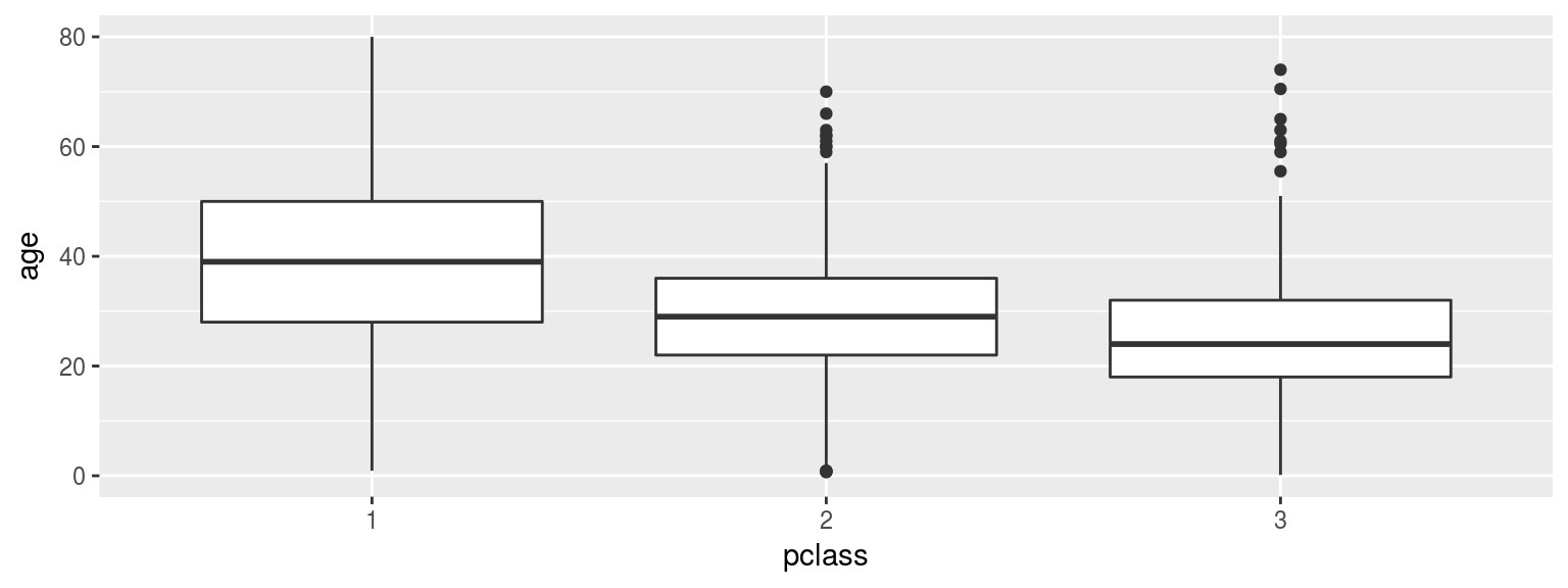
Visualize contingency tables
ggplot(titanic, aes(y = sex, x = pclass)) +
  geom_count()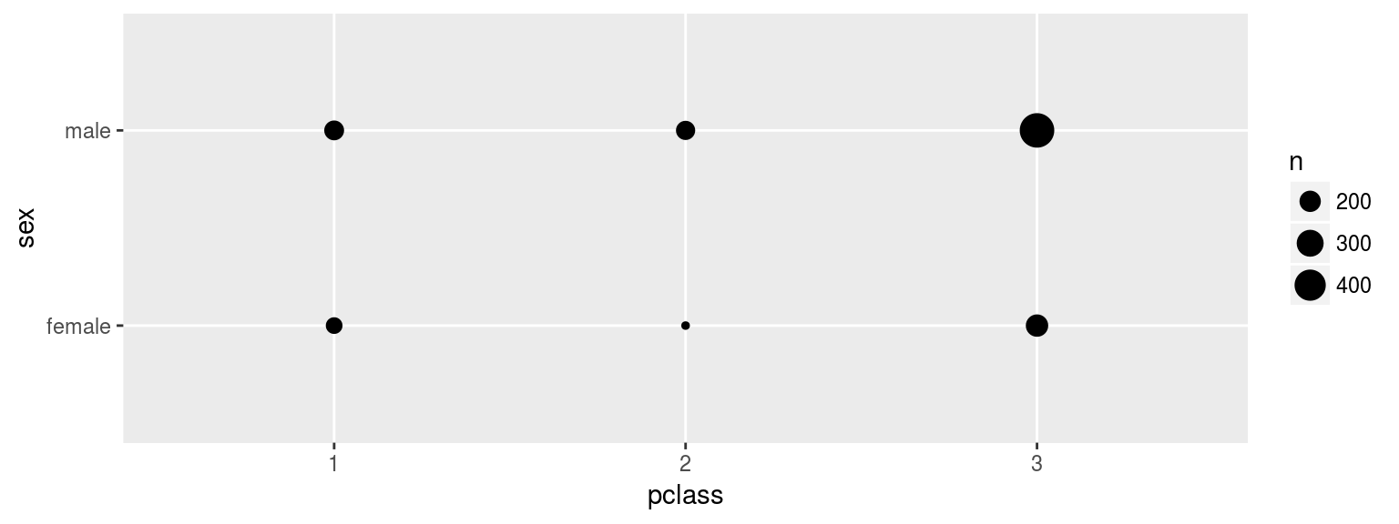
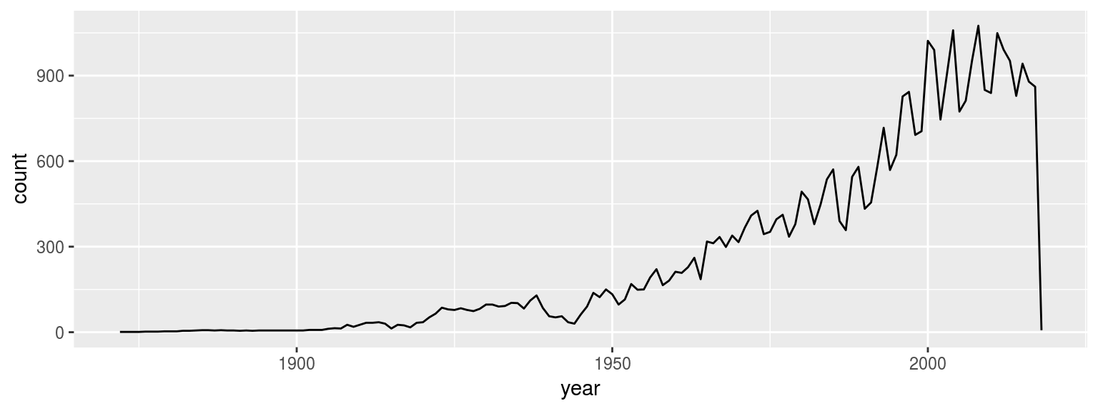
Count entries by year
library(lubridate)
soccer$date <- as_date(soccer$date)
soccer$year <- year(soccer$date)
ggplot(soccer, aes(x = year)) +
  geom_line(stat = "count")